Our journey building the “A Bunch of Things” app for the Apple Vision Pro
2024
.
02
.
09
/
Log
5
[EDIT: the app is now live on the App Store]
I've always been an enthusiast of 3D, VR and AR and I'm lucky enough that a significant portion of my engineering carreer so far has been dedicated to projects within that realm.
Even though the harsh VR winter of the 2010s left me a bit skeptical of new headsets, every time a new one hits the market I still get that old feeling of excitement back.
I work at a small startup called Things, Inc. That “Inc.” suffix makes it sound super serious and corporate but we’re just 3 people and none of us wears a tie or a suit. We have pretty fancy hoodies, though.
Needless to say, when Apple announced the Vision Pro, we were very excited to get our hands on it, so we decided to pre-order it as soon as it came out. While we waited for the headsets to ship, we started doing some preparatory work using the simulator.
We sat down and went over our plans for world domination. They started and ended with “let's just make something fun” (we’re not very good at world domination). We binge-watched the visionOS developer videos as if they were the highly anticipated post-cliff-hanger Season 2 of a not-yet-ruined TV series, then got to work.
Naturally, we had to divide our attention between this shiny new toy and our work in Rooms, but we decided it was worth dedicating a few weeks to this.
While there is no substitute to holding the actual device in our own hands, credit goes to Apple for having prepared extensive developer documentation that allowed us to have a pretty clear idea of what the headset was capable of, so we could start making progress right away.
What We Built
Without any further ado (and sorry for the previous ados), here is what we ended up developing:
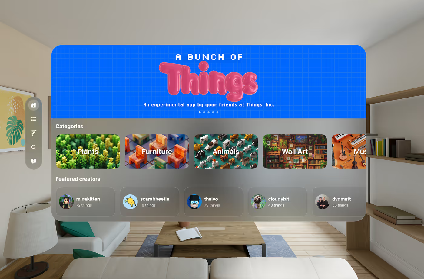
I say “ended up developing” because the decision process was far from straightforward. But more about this soon.
This app shows you a catalog of Things, which are user-made objects that people have created and uploaded using Rooms. When you click a category or tag, you are presented with a collection of Things:
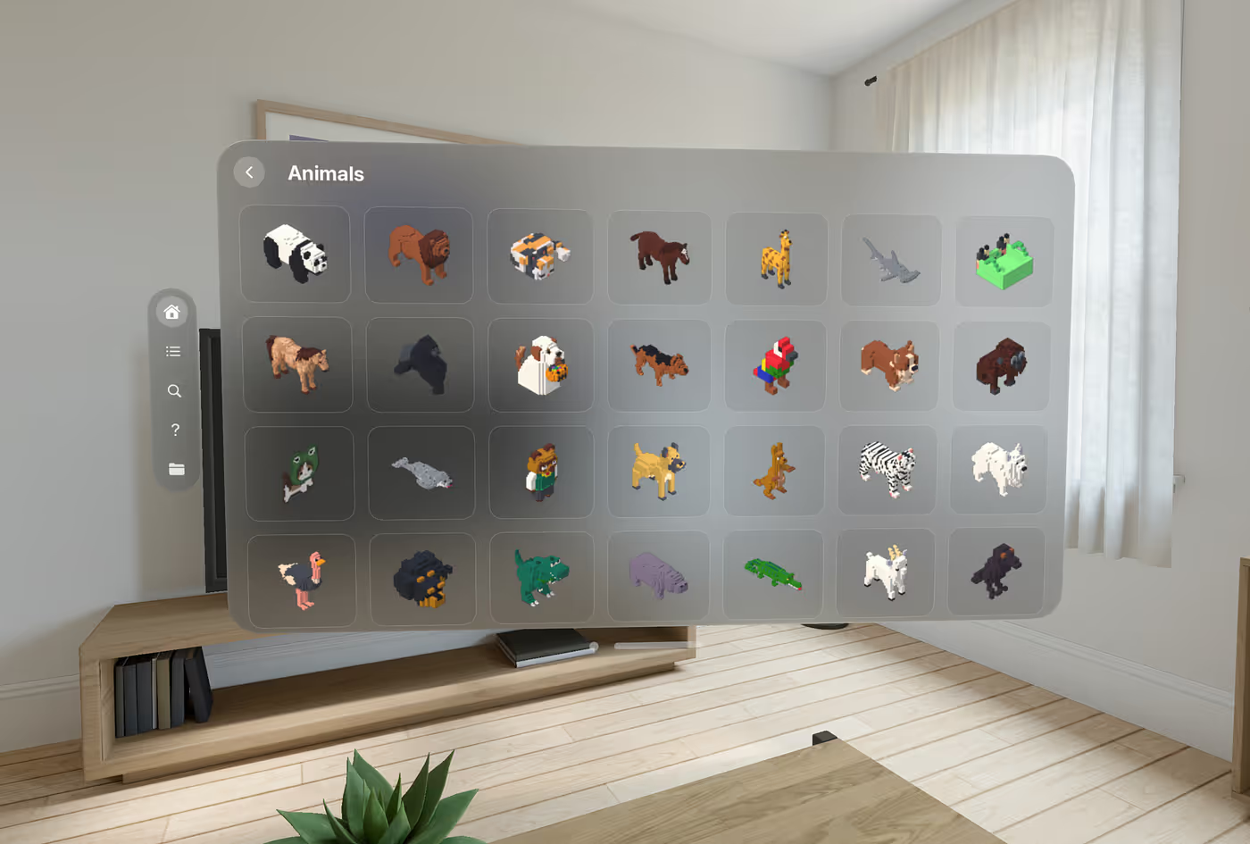
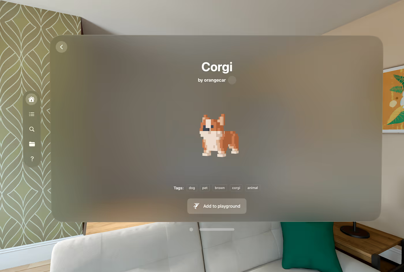
Need a voxel corgi? Who doesn't! Coming right up. This is the details view that shows the object and some information about it.
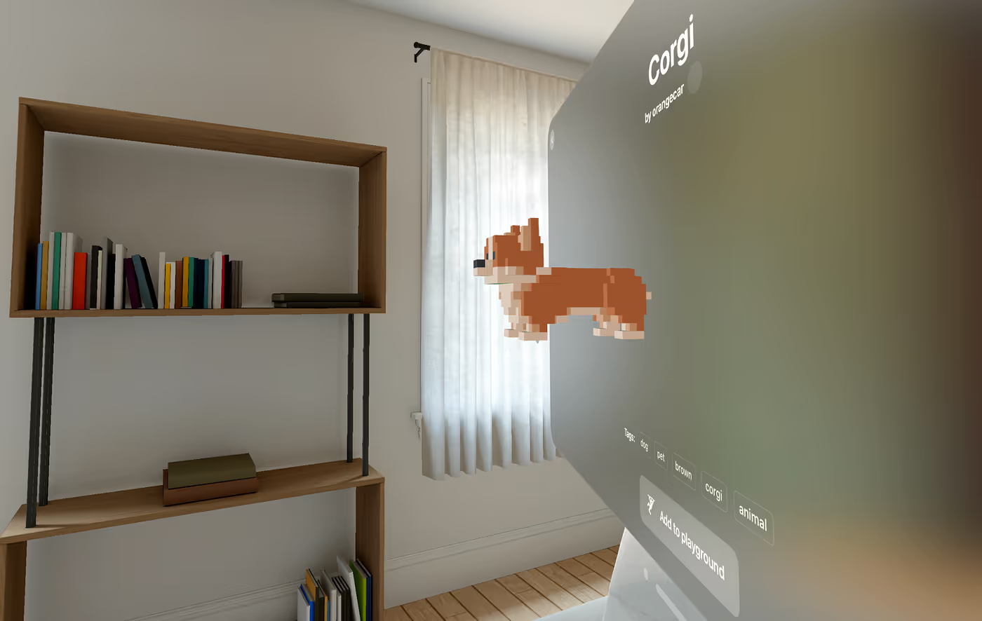
One of the (many) cool things in the visionOS SDK is that it allows you to embed a RealityView directly into the view hierarchy, so we can have a truly 3D widget where a model comes out of the window:
Now you can click “Add to Playground” and now you get your corgi delivered in a bubble (how else would you deliver a corgi?), ready to place anywhere in your home. Or the park. Or the office.
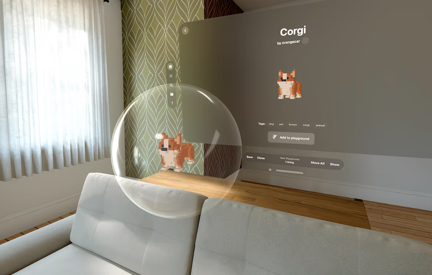
Here is the corgi on the couch.
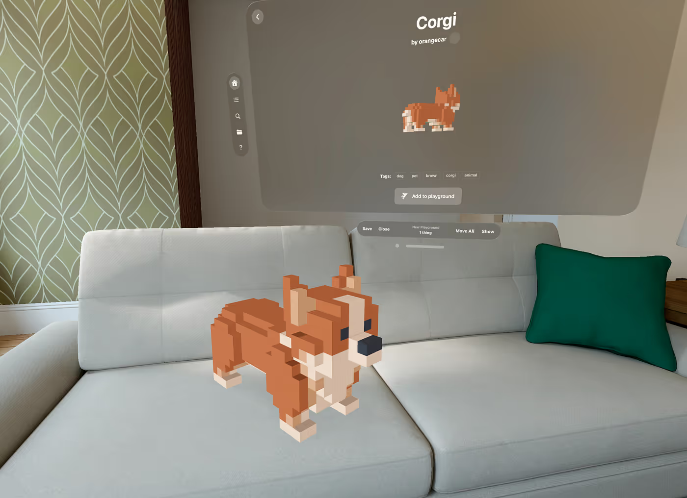
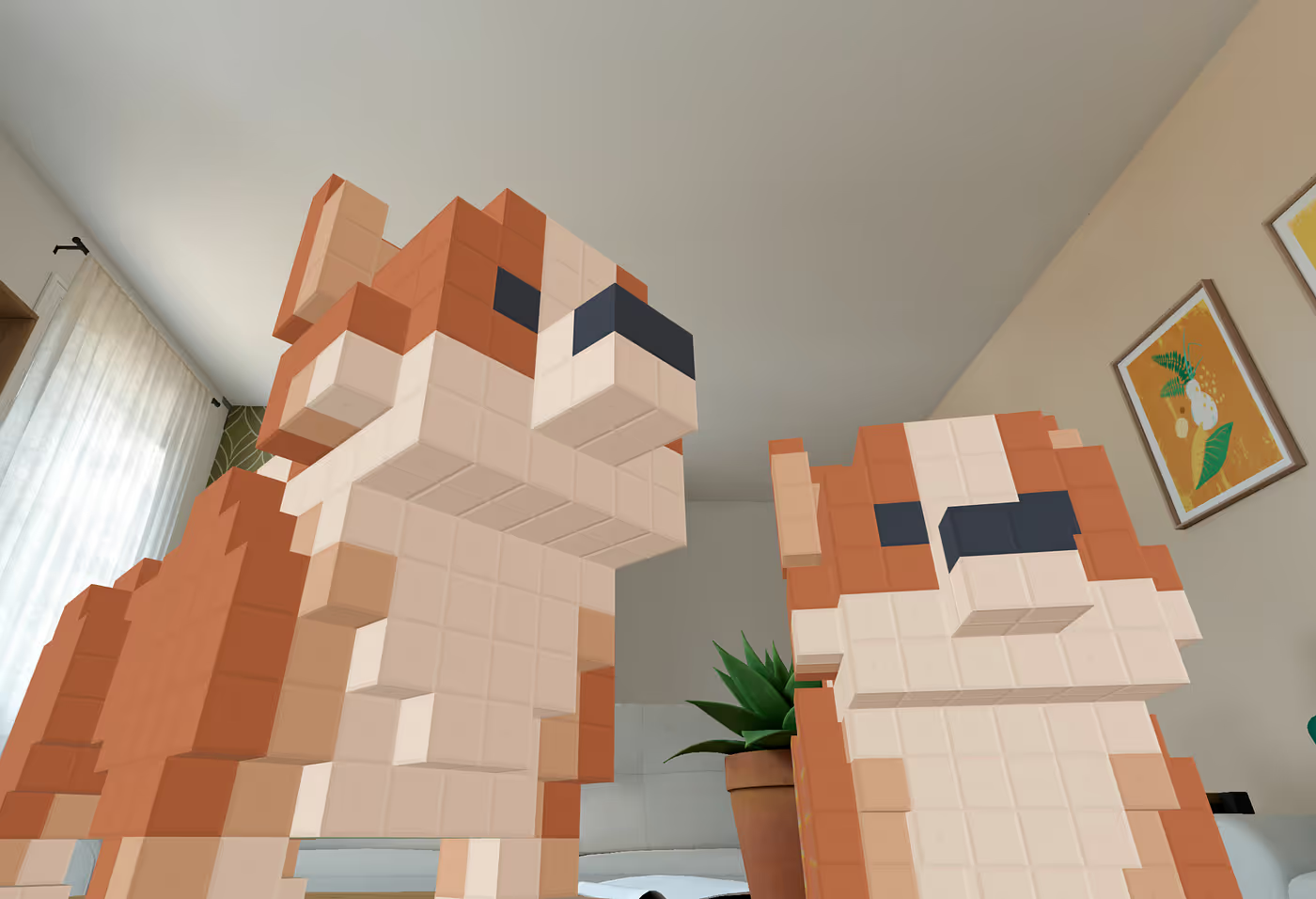
Using 3D gestures, you can move, rotate and scale the corgi. Or even go wild and put in two corgis. And make them gigantic.
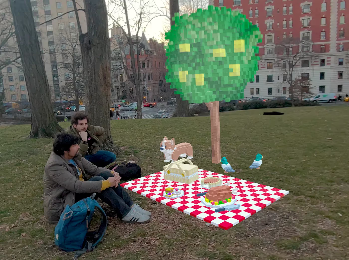
You are of course not limited to corgis, or your living room. Here's the team at Central Park doing a voxel picnic.
Behind the scenes…
Now that we talked about what we built, let me tell you a bit about the behind-the-scenes.
Our initial idea was Thing building, that is, voxel editing. We already have a voxel editor in the Rooms app, that looks like this:
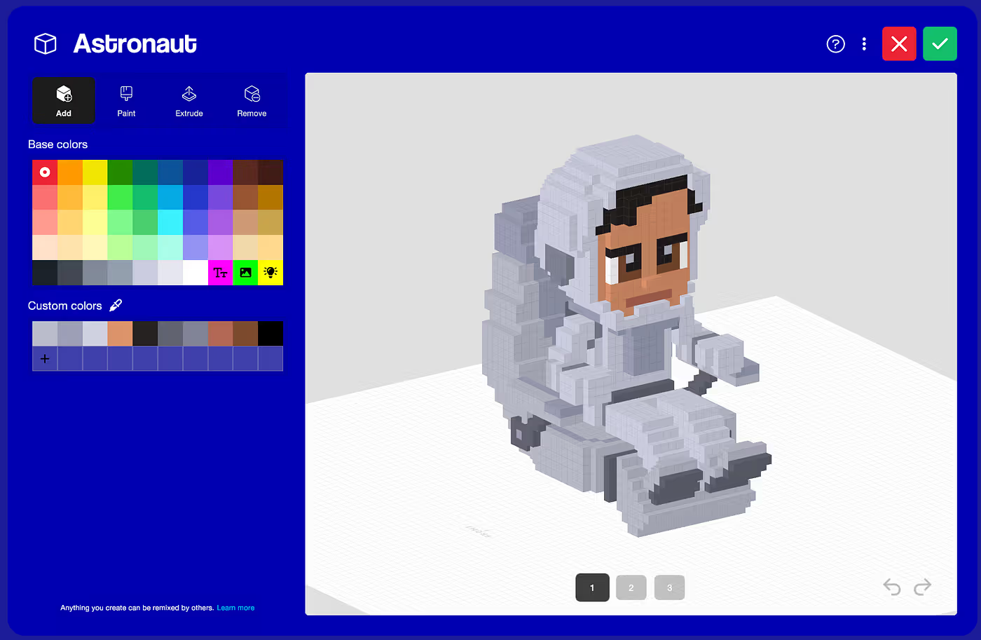
So naturally we thought “why don’t try this idea on visionOS?” After all, what could go wrong?
So I ported all our VOX parsing and mesh-building code from our C# codebase to Swift and RealityKit while Nick and Jason worked on the spatial UI for the app.
It was here that we started to understand that this new device had a very different interaction paradigm that we had to take into account.
Hover is in the eye of the beholder
One of the unique features of the Apple Vision Pro is its focus on user privacy. Because of this, and unlike previous headsets I’ve worked with, it doesn’t automatically expose some key pieces of information like the the user's head orientation, gaze direction, window positions, or even where the user is in the physical space.
All we can do is tell the system what elements can be interacted with, and it will take care of detecting if the user has made any gestures that affect those elements. In particular, even hover effects are completely opaque to the application: we just say we want hover effects, but we don't get notified when the user is hovering over our components.
This also applies to 3D graphics: we can mark certain entities as being hoverable and interactable, but we don't have any information about when that actually happens.
As a result, we can't “smartly” react to a hover state or a click on demand: whatever is hoverable or clickable needs to exist in the scene as a RealityKit entity.
We had initially intended to make a voxel editor, and actually started building it:
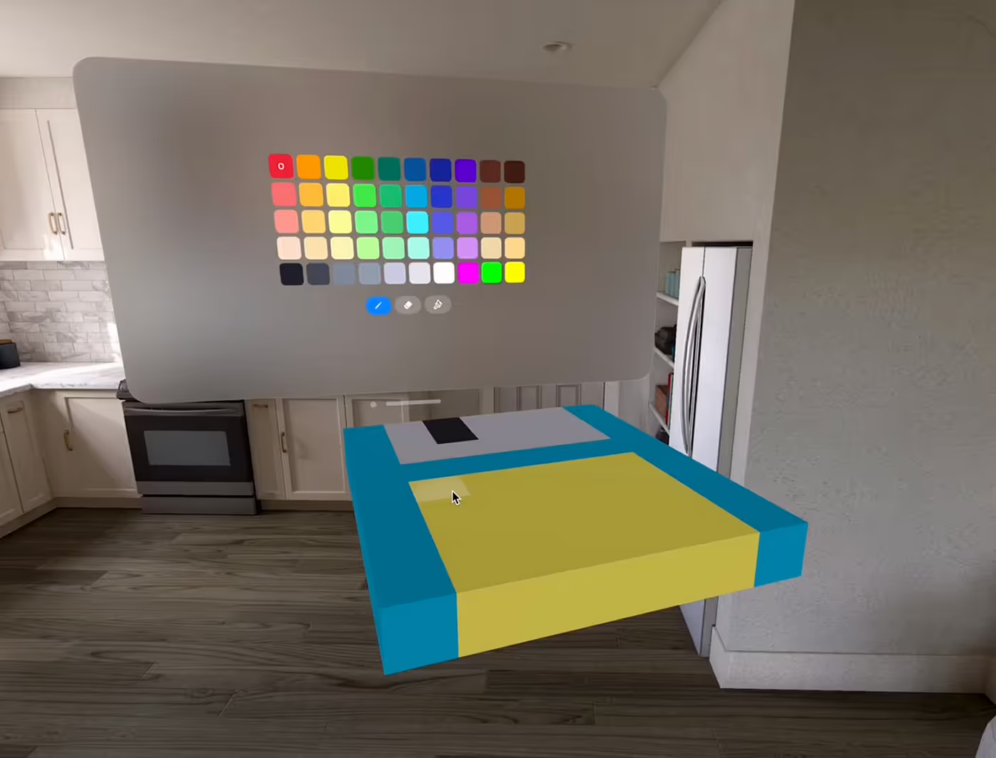
But because of this limitation (which, granted, exists for good reasons), every single voxel in the model would have to have a separate click target for each one of its faces on each one of its voxels, making it prohibitively expensive even for small models.
But at this point we hadn’t tried the actual headset yet! Maybe there was a surprise in store for us. It wasn’t out of the realm of belieavability that the headset would be so performant that having thousands of entities wouldn’t be a problem after all.
Engineers like me are quite good at wishful thinking when faced with the prospect of a painful rewrite of a major piece of software. I mean, surprisingly good.
Getting the headsets
With the headset ship date fast approaching, we decided to meet up in New York so we could spend a week together working on the app.
To be absolutely sure we’d get the headsets in time, we each bought one and shipped them all to Jason’s (our CEO) house. He monitored the delivery and heroically stood guard as the UPS truck came in with the goods.
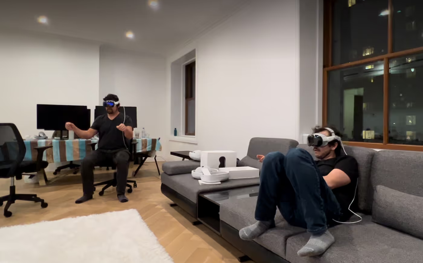
We tried on the headsets for the first time.
Magic.
We did the onboarding. It was incredible. Crisp high-res display, perfect eye tracking, natural hand gestures, immersive spatial sound, delightful UI.
We tested the latency using the “coaster test” where we tossed a coaster back and forth while wearing the headset to see if the latency was low enough that we’d be able to catch it with the headset on.
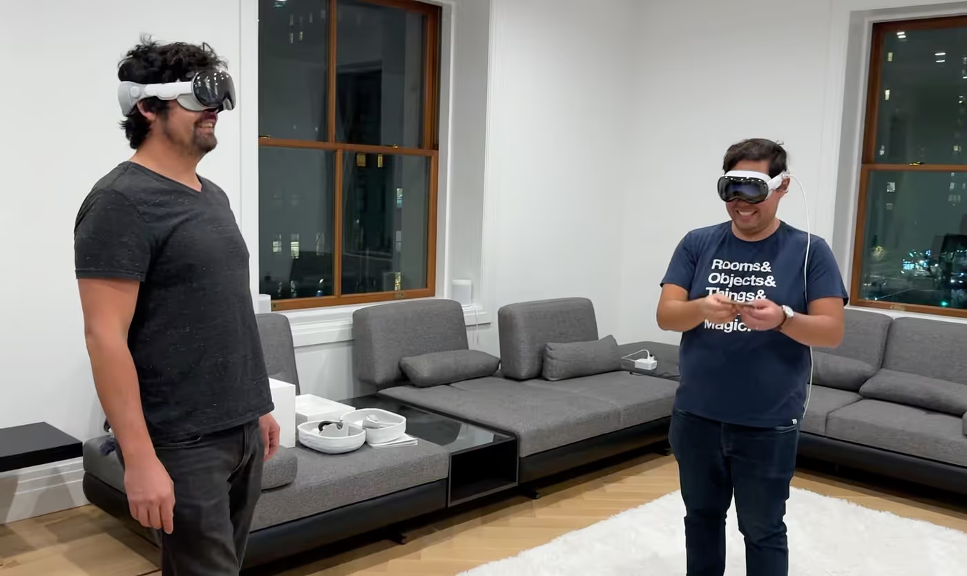
We realized that we can’t catch coasters even without the headset, due to their weird shape, so that wasn’t a good test. If you were reading this article for the scientific rigor, I’m sorry to disappoint you.
Issues
Even though the headset is state-of-the-art and the experience is excellent at first, we soon realized a few incompatibilities between our aspirations and reality (and when that’s the case, reality tends to win):
- Gaze-based interactions are intuitive, but not extremely precise (not to the level that they’d need to be for voxel editing).
- It’s not super comfortable to use eyes for precision work. Our eyes quickly got tired from repetitively darting from surface to surface to place voxels.
However, there were some unexpectedly good things we realized too:
- The headset’s image is sharp and clear, no blur whatsoever, and it’s so high-res that we can use our phones even with the headset on.
- Scrolling is fuuuuuuuun. Why is scrolling so fun? It doesn’t have a right to be fun, it’s scrolling. Even the settings UI is fun because there are lots of settings and you can scroll throught them.
- Other hand gestures are fun too (dragging, rotating, scaling).
Lots of finger pointing
Having thousands of entities in the scene sitting there waiting to be gaze-activated was a non-starter from the perspective of the hardware. Using our eyes to select voxels was a non-starter from the perspective of ergonomics.
Okay, so if gaze-based voxel editing wasn't going to work, we needed to figure out how the user can select where they want to place a voxel.
We searched far and wide for the answer and eventually found it at the end of our arms. What if we could simply point using our index finger towards the voxel we want to modify and do a gesture to edit it?
So I implemented hand tracking using the ARKit API, which required me to learn a bit of hand anatomy so I could understand the docs, for example when something returns a vector that goes “from the metacarpal-phalangeal joint to the proximal interphalangeal knuckle”.
So the user’s finger would be a “laser pointer” and they’d join their fingers or “click” with their thumb to place a voxel.
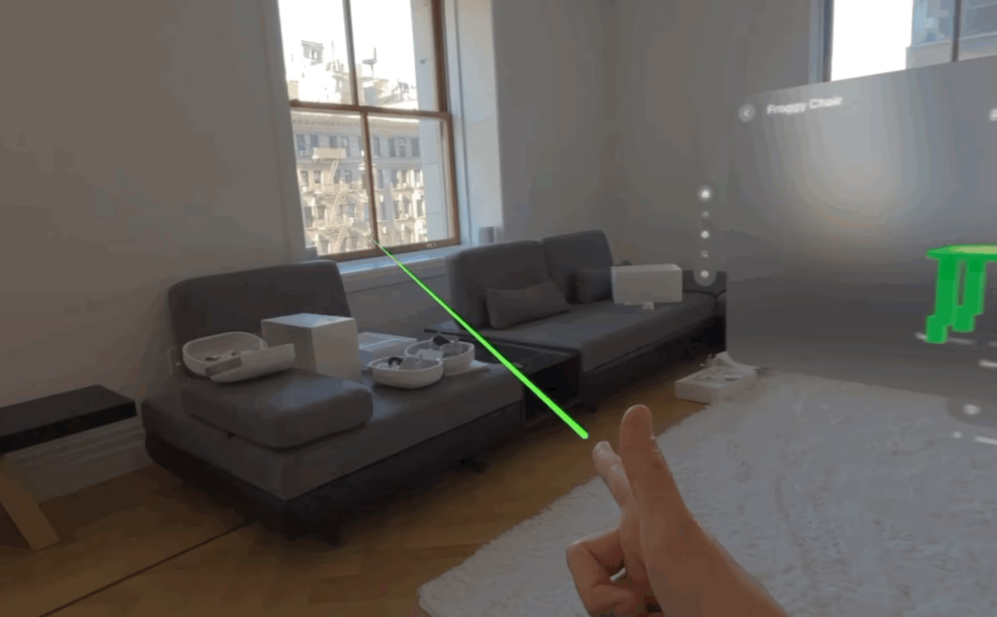
I enjoy having a laser coming out of my distal phalanges like anyone else, but we soon realized this wasn’t precise enough and it was actually quite tiring too.
We were running into the hardware limitations of human muscles and joints.
Let’s look at other apps
We looked at a lot of other visionOS apps on the App Store. Our fear was that it was going to be filled with so many cool apps that we would never stand a chance at getting noticed in that ocean of incredible apps, but, to our surprise, we were wrong: there were very few apps for visionOS, and even fewer good ones, at least based on our interests.
I mean, there were a lot of business and productivity apps, but I must admit that my dreams and visions of a futuristic sci-fi era of spatial computing didn’t include looking at a spreadsheet that’s hovering over my coffee table. My dreams of this future era don’t even involve coffee tables at all.
We saw that some apps were essentially 2D apps with a few 3D elements, including many popular mobile games, but the experience playing them on a virtual 2D surface wasn’t significantly better than playing them on a real tablet.
The great crisis of spatial computing at Things, Inc
This is when darkness set in. I mean, it was 6 p.m. in wintertime, but metaphorically as well: if there were no incredibly compelling apps in the App Store and our idea wasn’t working out either, was this an indication that it just wasn’t possible to do something interesting? Was it all just a big waste of time and money?
We decided to call it.
We had lots of features we wanted to implement in Rooms and the opportunity cost of not doing those was starting to nag at us, so we decided to put the headsets back in their (unreasonably expensive) cases and focus on an app that already has users and needs our attention. This was the adult, mature thing to do, and it was a solid decision that we’d look back upon and be proud of.
We even started listing everything that we were going to do in Rooms, now that we had decided to dedicate ourselves entirely to it:
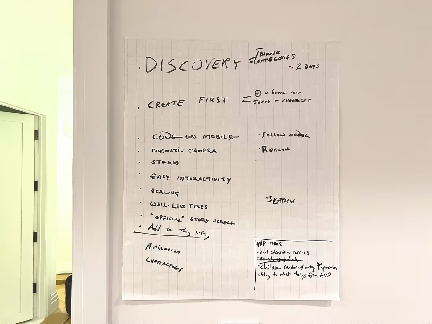
Thus began the great crisis of spatial computing at Things, Inc. We’d have to bravely endure these challenging times for however many months it lasted, in the hope that we’d eventually return to visionOS in a distant future.
This era lasted for 15 min.
The second age of spatial computing at Things, Inc
As we were burying this app and preparing to move on, our community manager, Matt Fogarty, was giving it one last try and actually doing something we hadn’t done before: using the app in earnest, as a user would. The most we had done up to that point was place one or two objects and immediately try to edit them, which led to the broken experience we described before. Instead, Matt didn’t open the voxel editor at all and just placed several objects from the library and assembled a little scene.
Nick tried, then me, than Jason. Our mindset was “yeah, we’re abandoning this, but let’s take one last last look”. But then we realized that if we didn’t use the voxel editor at all… it sort of worked. But we had already made our decision!
“This is fun. Oh no.” — Nick
A few minutes later, a new plan had formed in our minds: getting this into a good enough state to produce a video, which we would then tweet, but nothing beyond that.
Just a video. Because making an actual app was out of the question, it would take months. We’re very good at establishing these firm, well thought-out plans with realistic timelines.
“What if we ship the app by the end of the week?” — Jason
And there it was.
By then we had learned enough about the headset’s capabilities and shortcomings and we could finally envision how to make this app work. We dug it out of the trash can and decided that it was going to be all about browsing our extensive Things catalog, then placing the 3D models in your room so you could assemble little scenes for fun.
UI system
I dove deep into 3D math, entities and transforms, taking the occasional beating from Swift as I figured out such deep linear algebra questions as “why does the panda spawn with its butt turned toward the user instead of the front?”.
Nick and Jason designed and built a beautiful system for browsing the Things catalog, loading the data from Firebase and presenting it neatly into a home page, categories and even search.
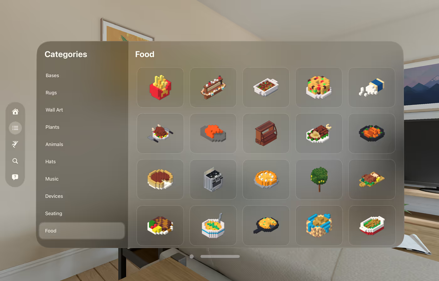
This included tons of work to organize the thousands of Things in the library in an optimal arrangement to ensure people have what they need to build interesting scenes.
Spawning things
One problem we had was that when you add a new object to the scene, it’s sometimes very hard for the user to notice that the object appeared, because their attention might be focused on the UI.
To add to the problem, there is no reliable way (as far as we know) to position a 3D object relative to a window’s position in 3D space, making it difficult to position the new object in a predictable spot that the user wouldn’t miss.
Our solution?
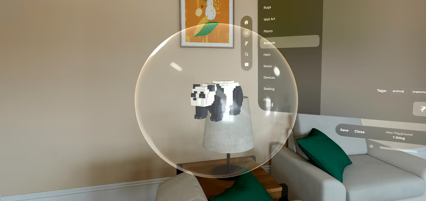
Just put the new object in a bubble! It marks it as being a new object, so the user knows it was just added and it’s easily noticeable. Nick even added spatial sound so the user has a sense of where the bubble is.
What sound does a bubble make in a spatial computing app from 2024? I don’t know. Something futuristic, but also friendly. “Organic cyborg,” was the term we used to describe it.
How to delete things?
Another interesting question that came up was: moving, rotating and scaling are easy, but how do you delete something you don’t want?
We could have a trash can, but that would interfere with the scene and we wouldn’t know where to put it (remember, we don’t automatically know where the user is in the scene), then the user would want to move it, etc.
So we decided to go with a fun approach: drag a thing under the floor, then they will turn red and explode in a cloud of dust. Once we learned how to do particle effects, we added them to a few more places too. Who doesn't love a particle emitter?
That's it. End of features. By Thursday morning we declared the app to be Feature Complete, and firmly said “no more functionality, only bugfixes from now on.”
As you might have come to expect from this article, that didn’t quite work.
To Save or Not To Save
Initially, the plan was to just see the 3D models purely for fun and there would be no way to save the scene you created.
So we were done. We started to play with the app, creating some scenes. But then we started having fun, and therein lies the danger. We started to feel disappointed because we’d lose the stuff we created.
I can smell feature creep from a mile away and there was a pretty strong aroma of non-feature-completeness in the air.
We knew this was a risk: if we had fun creating something, we would obviouslly want to save it.
There were only two options:
- (a) Make it less fun so people wouldn’t want to save
- (b) Implement saving
“When you give a mouse a cookie…” — Nick
I wasn’t familiar with the expression and I’m no expert in zoology, but I believe the problem with giving a mouse a cookie is that “it then wants a glass of milk” (though I have trouble imagining how the mouse would drink it).
So we said… what if we have a way to save? Let’s just do this one little feature that was out of scope, but it will be a small one.
“Hear this? That is the sound of features creeping in.” — Bruno
Thankfully, due to the way SwiftUI works, the data was already in a mostly serializable format that posed no major difficulty. Nick built the whole save/load UI in record time… and discovered several pebbles in what we thought would be a mostly pebble-free shoe: how does the user rename, overwrite, delete, gets warned about unsaved changes, etc? Thankfully these were all solved.
A trip to Central Park
At some point it was sunny out and since we hadn’t gotten out much from the apartment, we decided to walk a few blocks over to Central Park. But of course we can’t just walk in Central Park like normal people, we had to take the headsets with us and try it there.
It was a success: the app worked well and it was fun placing a voxel dog next to a real dog, an image I won’t include here in respect of the dog’s privacy (the real one, not the voxel one). And also because the real dog was pooping.
But here’s another one of Nick petting a virtual corgi under a virtual lemon tree.
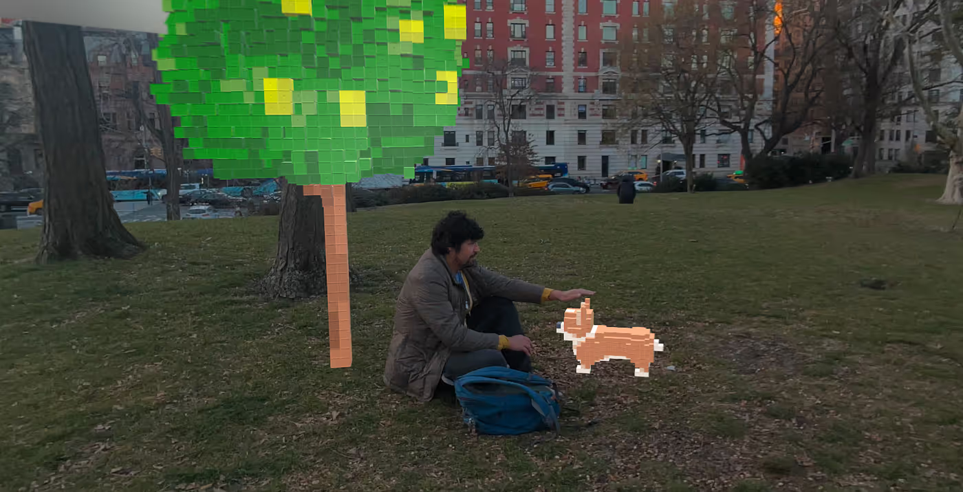
Someone actually approached us as we were doing this.
“New toys?” — Random person in Central Park
The accusatory tone in the question prompted us to clearly state that we weren’t having fun at all, this was strictly for work, to which this passerby seemed satisfied, as if saying “in that case it’s ok, as long as you’re not having fun.”
We totally were, though.
Final Prep for Submission
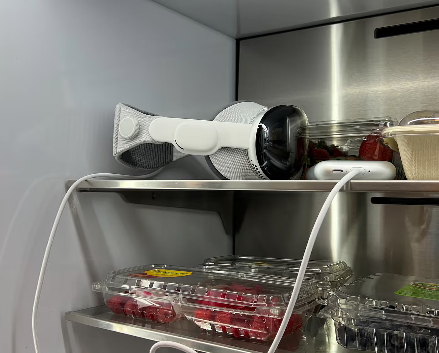
Shooting the promo videos and app store screenshots was not an easy task, as it requires a special process that takes high-resolution images from the headset. Jason spent hours working on this. It turns out this causes the headset to heat up a lot, a problem that was fortunately easy to solve:
As I write this final paragraph, it’s past midnight on Friday and we have just submitted the app for review in the App Store, so we have succeeded in finishing this app in the time we had allocated.
It doesn’t have all the features we wanted, but it has all the features we think are crucial: it’s a cookie with half a glass of milk.
After these few days of intensive work, I feel incredibly tired but paradoxically also very energized. I’m looking forward to see what users will do with this app!
EDIT: The app is now live on the App Store.


